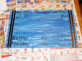
My girlies have a cute little kids table in the kitchen that they sit and eat at. Surprisingly, above this cute little table has been a
blank wall! (The only blank wall in the house:) ) I've had the idea for a while to make a couple of
vintage looking signs for the wall, incorporating things that have to do with my kids.
This is the first one, and I love it! It hangs above my older daughter's chair, and is totally her.
Her nickname is in the title of the diner, and
her favorite meal is breakfast.
She would eat pancakes, waffles or cereal for every meal if I let her!
A couple of weekends ago, we also went to a
Maple Sugaring Farm here in New England, which was a blast! We watched the maple sugar being made, and saw all the taps in the trees where the sap flows from.
Hanging to the right of the sign are 2 used maple sugaring taps - which I purchased in the farm's gift shop. They were just the perfect touch I was hoping for! They look old, and they complement the theme of the sign. Score!
So, do you want to know how I made this sign?? Get comfortable - because there are quite a few steps:) Still, I think this project is very manageable.
At the hardware store, they sell wood by the linear foot. This means that you don't
have to buy the entire board if you don't want to. So, I had them cut me a piece of 12" wide wood to 18" long, and I only had to pay for 18"! Perfect:
I started by painting a base coat. I chose antique white, and some shades of orange, and spread them over the entire top and sides of the board. Throughout this process, I was not very careful with making the coats even, because it helped provide the vintage look I was going for. I used a foam brush to apply the acrylic paint, and below shows a picture of my first coat.
When my 1st coat was dry, I
added vinyl lettering to anything that I wanted to remain this white color by the very end. It served as a barrier for any paint that I would put on over it.
If you don't have a way to get vinyl lettering, you can certainly wait until the end to paint all your words on, and just do them by hand. You will still want to paint multiple layers of base paint in a variety of colors though.
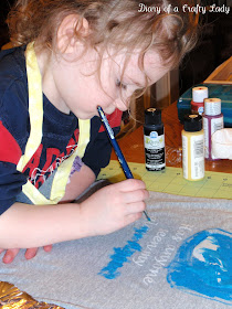
So, my second coat was bright blue. Again, you can see that I did not put on a heavy coat, nor did I try to make it even.
When the 2nd coat was dry,
I applied vinyl strips to the parts that I wanted to remain blue. Here I wanted two strips on the sides to stay blue, and a few "stars" (aka asterisk). This could have been done with masking tape or contact paper as well (since strips are easy to cut by hand).
My third coat was this dark brown. I used a variety of brown and red/brown acrylic paint.
When the 3rd coat was dry,
I applied vinyl to everything I wanted to remain brown. In this case, the shape of a syrup bottle.
Finally, I added my 4th and final coat of paint, which is the color that my sign would finish as. This color is darker than the antique white that I used at the beginning, so that the words that were in antique white would still stand out.
I wanted a fun retro shape for my logo, so I traced a this funky thing in the middle...
...and painted it in with light blue.
I considered painting the words "Jossy's Diner" by hand, using a transfer paper method (
just like I did in this post - no vinyl required!). Instead, I made another stencil:
And painted blue inside:
Now comes the fun part...getting to pull of the vinyl.
I wanted to jazz up the syrup bottle a little bit, so I pulled off the vinyl shape, but left the vinyl words underneath - to be pulled off later. I didn't want those words to be painted over at all, so that vinyl didn't come off until the
very end.
Again, I could have painted the details by hand, but I was going crazy with my Silhouette by this point, and decided to mask off each section with vinyl.
I painted a silver handle, and a maple leaf in the middle of the bottle.
And since that was the LAST bit of painting,
I peeled off ALL THE VINYL, and was left with THIS!!!! Coooooool:)
I took a 120 grit piece of sandpaper to it, and went to town (strategically).
As I sanded, the color from the coats of paint underneath peeked through, and made it look even more old and worn.
I was 99% satisfied, but not quite happy with the fact that the "Waffles" and "Pancakes" section was hard to read.
So, I painted over those parts with the brown color....and roughed it up again:)
I attached some hanging hardware, and stepped back to look at my handiwork. I LOVE IT!
I am going to make another one for above my younger daughter's chair at some point - so stay tuned for that!
Now, I know this is a very detailed sign, but this same technique can be used in a much simpler format. In fact - pretty soon, I plan to post about it :)


